After the turn of the 19th century into the 20th, the visual arts branched into numerous different styles each with their own unique characteristics. No longer could an era be categorized by one dominant style.
“Modernism” is a large, encompassing term to pull together these disparate art movements. There are several themes that exemplify “Modernism”:
1. Color as expressive tool (rather than describing reality)
2. Mystical design theories (eg, the “Golden Ratio”
3. Utopian thinking
4. Interest in the “primitive”
5. Man’s relationship to the machine age and industrialization
6. Rejection of “art”
7. Revolutionary politics
Modernist movements can also be divided into three categories:
1. Movements that deal with aesthetic and expressive issues of art (art for art’s sake)
2. Movements that are progressively utopian
3. Movements that pit themselves against cultural norms (protest art)
For the sake of simplicity, I will delve into just one of the Modernist movements: Futurism.
Futurism
Futurism as an art style began in Italy. However, it wasn’t just about art; it was a cultural movement that encompassed all aspects of life. It valued speed and movement, embraced war, and elevated the machine age such that they thought machines were more beautiful than classical figures.
Design Project: Designing “Ideal Citizens”
Part one: Research
For this project, we were tasked with designing two ideal citizens; one man and one woman. First, I researched Futuristic clothing, to get a better idea of what clothing would look like with a Futurist twist.
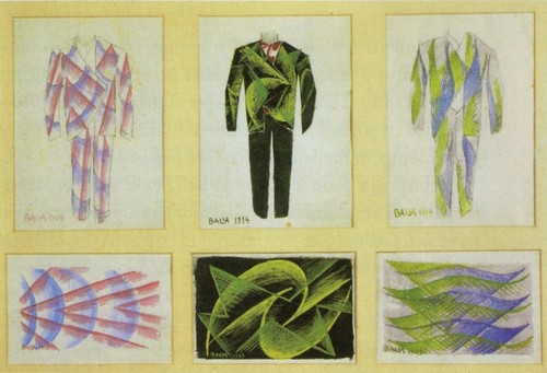
Giacomo Balla, a fairly well-known Futurist artist, designed clothes as well as made paintings. As with the Futurist painting, several stylistic elements stand out:
Giacomo Balla. Jacket. 1930. Tempera on paper. 18.5 x 13.5 cm.
Giacomo Balla. Jacket. 1930. Tempera on paper. 18.5 x 13.5 cm.
Giacomo Balla. Futurist Clothing. 1914. Tempera on paper. 29 X 21 cm
Speed lines, strong colors, and geometric shapes cut through a solid background in these designs. There is much less blending than in the painting, which emphasizes the love for speed that was a large part of Futurist beliefs. One primary color and one or two secondary colors make up a lot of Futurist clothing patterns.
Fortunato Depero. Costume for Le Chant du rossignol. 1919. Tempera on canvas. 75 x 52 cm.
Part two: Design
For the woman, I was inspired by this quote from Valentine de Saint-Point’s Manifesto of Futurist Woman: “Lust is a strength, because it destroys the weak, excites the strong to exert their energies, thus to renew themselves. Every heroic people is sensual. Woman is, for them, the most exalted trophy.” (1). She emphasized that the Futurist Manifesto’s “scorn for woman” was in reality scorn for the culture of femininity that she believed to be weak and a detriment to both genders. Instead of being the gentle, demure, and modest women previously valued by society, she called for women to embrace lust as a process of natural selection. (2)
Taking this in mind, I decided to make my female character more sensual and revealing. The overall color scheme and shape of her dress was inspired by the first Giacomo Balla vest.
For the man, I used the same color scheme as the woman. I had the shape of the suit resemble one by Giacomo Balla, except I gave him more militaristic boots to go with the Futurist’s love of war as the “hygiene of the world”. I also gave him a gun to emphasize the warlike nature. His hat is supposed to help emphasize the geometric shapes in the clothing, and was inspired by Fortunato Depero’s costumes. The hat helps make the man look taller, and therefore faster.
On both characters, I used simple triangle-like shapes to create a feeling of speed. The dark background of the clothing makes them stand out, like they are lights shooting through the darkness. It made me think a little like laser guns being shot at night, which I felt went with the love of machines and war.
I decided to use a simplified realistic style rather than going full-Futurist for the character sheet, to make it easier to see the characters. I used their clothing as a canvas for Futurist design, rather than the whole figure. To me, this turned out well and was easier to execute than a completely stylized character.
Overall, I believe I portrayed the basic values that exemplify Futurism in this design. With speed, war, a hint of the machine, and a bit of lust, these characters could fit into a Futurist future.
Sources:
(1)Manifesto of Futurist Woman. Valentine de Saint-Point. URL: http://www.mariabuszek.com/kcai/DadaSurrealism/DadaSurrReadings/FtrstWoman.pdf.
(2) Tisdall, Caroline, and Angelo Bozzolla. “Futurism and Women.” Futurism. New York: Oxford UP, 1978. Print.
Futurist Fashion: Three Manifestoes. Author(s): Emily Braun. Source: Art Journal, Vol.54, No. 1, Clothing as Subject (Spring, 1995), pp. 34-41. Published by: College Art Association.Stable URL: http://www.jstor.org/stable/777504.
Fin de Siecle, or “end of the century”, was a period that encompassed several different art movements at the end of the 19th century and beginning of the 20th. The Vienna Succession, Art Nouveau, and Arts and Crafts all fall under the umbrella of “Fin de Siecle”.
During this period, the industrialization of printing lead to an explosion of commercial illustration, with new magazines dedicated to prints and etchings, and illustrated advertisements became standard. This image by Mucha is typical of advertisements at the time:
Art project- design a pattern sheet and illustration
For this project, we were tasked to make a pattern sheet and an illustration that could appear in the magazine Pan.
As a class, we went to the Frye Art Museum to see their Fin de Siecle exhibit, which had a bunch of illustrations from the German magazine Pan. In addition, there was a section on the decorative arts, which I used as reference for my project.
I decided that I would stylistically emulate Mucha for this project. He created a book of designs, called Documents Decoratifs, that I used for reference and inspiration when creating my style sheet.
Mucha had some strong themes and elements that make his art fall under the Art Nouveau umbrella:
Compared to the previous style sheet from the Frye Art Museum, Mucha’s design is made up of larger shapes with less small details. The flowers are fairly simple and repetitive in design. His colors are very limited, which was common for printing at the time. To be sure I didn’t accidentally use colors that were unavailable at the time, or out of his usual color range, I color picked directly from this image when making my own sheet.
Part two: design
In order to get a handle on drawing flowers, I did many studies before settling on some I liked enough to make a pattern out of. Alphonse Mucha also did sketches before working on the final design.
Here is my final design sheet:
I kept my flowers fairly bold and simple, to keep with Mucha’s style. Mucha’s designs were somewhat more complex than mine- I used flipping and repeating for the most part to create my design, whereas Mucha had more complex overlapping going on. Since I am no design expert like Mucha, I played it a little safe in order to make an appealing pattern sheet.
Part three: the illustration
At the Frye’s Pan Selection, there was an illustration by Mucha. I decided to use him as inspiration for the illustration as well. After looking at many of Mucha’s prints, I decided to use this one for my main reference:
Alphonse Mucha. Lily. 1898. Color Lithograph. 103.5 x 43.5 cm
I lifted the colors directly from this lithograph, to make sure I kept to a strict color range. Digital media has the ability to go wild with colors not available in the past, so I wanted to play it safe.
First, I did some sketches until I found a general pose that I liked. Then, I took pictures of myself in the same pose to get reference- something Mucha did frequently for his illustrations (though he got to use models).
This is the result:
I used the flowers from my pattern sheet for the floral element. Since I’m working with a hand injury, I didn’t want to injure it further with a bunch of unique flora. Ideally, I would have bathed her in flowers like the example from Mucha. I used little modeling, with only two slightly different shades in the figure for the gentle shadows on her dress and skin. The figure is purely decorative, like the flowers, with her pose emphasizing the vertical composition. This vertical layout was common in Mucha’s posters.
In the end, I feel like with the colors it looks a little too similar to my Mucha reference. If I was braver, it would look more unique with a different color scheme. Some of Mucha’s posters are bordered with floral designs, and I think that would have also looked nice here. However, this illustration does hit the major points for an Art Nouveau piece: flatness (no background to speak of, lines to model form), figure as decoration, natural forms, and a limited color scheme.
The development of pre-mixed paint gave artists the ability to paint outside, which lead to an explosion of expressive landscapes and outdoor scenes. Gas lights also gave rise to a new night life, where people in cities could stay out late and socialize. Scenes of city night life became a favorite subject of many painters.
Photography was also invented around this time. Many artists lost work, since photography was cheaper and more accessible for portraits and history painting lost it’s importance as photographs were much more accurate. However, photography took pressure off artist’s having to slavishly depict reality- this new freedom to explore art that wasn’t an illusion of form gave rise to new and varied movements in the art world. One of them was impressionism.
Elements of a Style
No longer tied to accurately depicting form, Impressionists valued color and light above all else. The Western Picture Plane became less important- paintings in this style often appear flat without the illusion of depth. The Impressionists didn’t try to hide their paint, and instead celebrated it as an important part of the artwork and not something to be disguised,
The opening of Japan to trade brought a new influx of Japanese art, something many of the Impressionists were fascinated with. New stylistic elements show up in Impressionist works that were borrowed or adapted from what they saw in Japanese prints.
Rejected by the classically-minded salon, a group of Impressionists opened up their own exhibition to the public.
While each artist had their own unique style, there are several elements that bring Impressionism together as an artistic movement:
Claude Monet
Monet is one of the most well-known of the impressionists, and was one of the most prolific. Though he struggled financially for many years, he eventually achieved a great level of success and fame in his own lifetime; something many of his fellow impressionists weren’t lucky enough to obtain.
Throwing away the old academic values for strict adherence to visual realism, Monet was instead fascinated by light and color, in particular capturing the fleeting colors of a moment- something cameras at the time were incapable of. For him, subject matter wasn’t as important as how it was painted.
One of the things that Monet is famous for is his serial paintings, in particular his lily pond series. Before Monet, no western artist had created such a series of paintings about one specific scene or object. The only other artist to have done something similar was Japan’s Kasushika Hokusai and his “Thirty-Six Views of Mount Fuji”, which Monet might have seen. (1)
Design project- Monet style series paintings
Part 1: Research: How did he do it?
For this project, we were tasked with re-creating the style of an impressionist painter and doing two works of a single subject in different lighting conditions. I chose Monet.
Since we can’t just watch a youtube tutorial on Monet’s technique, a little more sleuthing was required. While he never gave a concrete blow-by-blow on his style, Monet did give tips and hints throughout his lifetime that I was able to pick up a couple clues on how he achieved his signature look.
To my luck, a painting of Monet’s was recently damaged, and the National Gallery of Ireland did thorough research and scientific analysis in order to precisely re-create his process so they could repair it. They found a couple of things that made Monet’s painting how it is (2):
Monet also used a limited color palette, avoiding browns and black. When asked what colors he used, he said:
Part 2: Putting the research to the test
First: choosing a location
Ideally, I would have liked to find a nice garden with lots of colorful flowers. However, with time constraints and needing to be able to work directly from life rather than just a photograph, I chose to do my back yard. Though containing far too much green for a good color range, I was still able to put my research of Monet’s technique to the test. I worked mostly directly from my window, but I took pictures to show a general idea of the light I was working with:
Second: Creating a palette
In order to stay true to the limited colors that Monet used, I put several of his paintings through an online palette generator (http://www.cssdrive.com/imagepalette/)
Third: Toning the background and blocking out the composition
Fourth: Lots of brush strokes!
This project made me really think about what color was actually there, instead of what I thought I was seeing. For example, in the dark, I at first tried to make the tree brown since instinctively that is the color of a tree trunk. However, in the dark, cloudy evening light, the tree was in reality more of a purple/blue color. I believe this is what Monet meant when he told a pupil to think about not what the object is, but rather to concentrate on the small shapes the colors make. (4)
I struggled with the sheer amount of small brush strokes required to make an authentic-feeling Monet style painting. With a hand injury, I settled on getting the closest I could without hurting myself too much. At a small size, it doesn’t look so bad, but zoomed in you can tell I needed more brush strokes.
Using Photoshop instead of real paint also presented its own unique challenge: one thing that makes Monet’s style special is the thickness of the paints he used. He would sometimes use very thick globs of paint to create a relief that would add a special texture or value. Also, the brush strokes with paint have a unique look that is hard to emulate digitally. I found myself continually frustrated at how “same-ey” my strokes looked, while Monet’s had much more texture and range. I tried to stay away from using the opacity settings in Photoshop, since the program uses a mathematical algorithm to calculate colors that would stray away from authenticity if I accidentally blended things on low opacity. It might have looked better, but I felt it was more accurate if I picked colors directly from Monet paintings and turned off opacity when digitally painting.
In the end, this project was a valuable exercise in experiencing the Impressionist way of looking at light and color. Though my product doesn’t look amazing, it is vastly different than anything I would have done on my own and keeps to the basic principles of Monet’s style.
Sources:
(1) Brodskaya, Nathalia. Great Masters : Claude Monet. New York, NY, USA: Parkstone International, 2010. ProQuest ebrary. Web. 2 April 2015.
The Romantic period threw out the order and rationality of the Neoclassical and instead valued emotion and feeling in their art. They looked toward nature as a source of beauty and stopped trying to imitate the Greeks and Romans. Medieval European imagery made a comeback, with people idealizing what they viewed as a more emotional connection to the past than the classics. Much like the transition from the Renaissance to the Baroque, Romanticism wanted you to feel.
Thumbnailing Romanticism
Sources:
Jansen, H.W. Janson’s History of Art. 7th ed. Upper Saddle River, N.J: Pearson Prentice Hall, 2007. Print.
Neoclassicism and Romanticism: Architecture, Sculpture, Painting, Drawings, 1750-1848. Special Edition ed. Cologne : Ullmann & Könemann, 2007. Print.
The Neoclassical period of art arose out of a world in turmoil. In particular, the US and France went through revolutions in the late 18th century and the industrial revolution started in England. One major impetus for all this change was a new way of thinking called the Enlightenment.
The Enlightenment was a modern philosophy that valued sensory experiences as a basis for science, instead of gathering knowledge and data from superstition or religion. This new way of thinking greatly advanced science into what it is today, and disciplines such as chemistry and natural science were established.
One important thinker of the time was John Locke, who promoted the idea that people should be granted certain basic rights. To him, governments were obligated to protect and promote these rights, and citizens should remove any government which failed to do so.
This thinking was instrumental in the revolutions of the period.
Important philosophers such as Voltaire started looking back to Greece and Rome for a model of ideal civilization, combined with the discoveries of Pompeii and Herculaneum to bring Classical thinking and aesthetics back to popularity. People started to reject the ornate flamboyance of the Rococo and Baroque styles in favor of the solid, geometric styles of the ancients. In architecture, function outweighed beauty and buildings lost the superfluous ornamentation and impractical facades of previous styles and gravitated towards austere, classical grandeur.
In painting, there are several elements that classify the neoclassical style that developed.
Outside of Italy and Spain, the rest of Europe was going through the Reformation. Religion became less centralized, and as a result artists lost one of their biggest patrons: the church. Protestantism also kept closer to the bible: in particular, the part about not worshiping idols. Churches stopped commissioning large, expensive artworks. With the exception of Flanders, which was ruled by the catholic Spain, a lot of European art moved away from the church and into the home.
For the purposes of this post, we will concentrate on the Dutch Republic. Unlike the absolute monarchies of other nations, the Dutch republic had no ruling family to commission grand portraits. With the increasing profits from trading, a growing middle class became the new art market and drastically changed the way paintings were made. It became the norm for many artists to first create a work and then try to sell it, without a commissioner to dictate the content of the painting. This developed into a dividing of painting into four different types:
History Painting: Anything containing specific people doing specific things, be they real historical figures or mythical/ biblical people. It was considered the most prestigious form, and generally commissioned.
Portrait: An image of a person, with nothing specific going on.
Genre Painting: Anonymous figures in scenes of everyday life. Sold as a form of entertainment, and often told moral stories.
Landscape: Often idyllic scenes of country life, generally not commissioned.
Sub-genre: Animal painting
Still life: Generally a pleasing arrangement of objects. Mostly un-commissioned.
Examples:
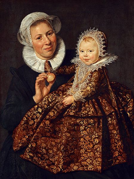
Frans Hals. Catharina Hooft with her Nurse. 1619. Oil on canvas. 33.9×25.6in. Gemäldegalerie, Berlin
This is also an example of a Portrait painting. It has named person (s) not doing anything in particular.
Rembrant. Jeremiah Lamenting the Destruction of Jerusalem. 1630. Oil on panel. 22.8×18.1in. Rijkmuseum, Amsterdam.
This scene is of a specific person, Jeremiah, doing a specific thing from a tale in the bible. Therefore, it’s a History Painting.
Johannes Vermeer. The Milkmaid. 1660. Oil on canvas. 17.9x 16.1in. Rijkmuseum, Amsterdam.
This painting by Vermeer is a great example of a Genre Painting. The subject is an anonymous woman, doing something from everyday life. Since she isn’t a figure from history or myth, it isn’t a History Painting.
Jacob van Ruisdael. Landscape with Waterfall. 1665. Oil on canvas. Saint Louis Art Museum.
With no named figures or anonymous persons taking the focus of the painting, this is a classic Landscape.
Maria van Oosterwijck. Still Life with Flowers and Butterfly. 17th century.
This Still Life is by one of the well-known female artists of the Northern Baroque. Since still lives didn’t require studying the nude model to obtain competency, it was viewed as an acceptable subject matter for female artists. Therefore, this period saw a rise of female painters like Maria van Oosterwijck being able to make a name for themselves with still life painting.
17th Century Painting Hierarchy in Skyrim
In order to get a better grasp on the differences in the various types of painting, let’s see how they would apply to a video game like Skyrim.
Bethesda Game Studios. Ulfric Stormcloak Waits for His Execution. 2015. Video Game. Screenshot by the author.
In this first example, we see a specific character, Ulfric Stormcloak, doing a specific thing- waiting for his execution. Therefore, this would fall under the History Painting category.
Bethesda Game Studios. Ulfric Stormcloak. 2015. Video Game. Screenshot by the author.
Here, we see the same specific person, Ulfric Stormcloak, but this time he is just standing there not doing anything. This means it’s a Portrait.
Bethesda Game Studios. A Hunter Tends His Fire. 2015. Video Game. Screenshot by the author.
This time, there is no named character at all. Instead, it is an anonymous hunter performing a daily task. This puts it in the Genre Painting category.
Bethesda Game Studios. Idyllic Scene on the Riverwood Road. 2015. Video Game. Screenshot by the author.
This image has no main characters at all, and instead focuses on the scenery and wildlife. This makes it a Landscape.
Bethesda Game Studios. Skyrim Tableware. 2015. Videogame. Screenshot by the author.
This last example shows a collection of items arranged for the viewer. With no scenic area taking the majority of the picture nor any named or unnamed central characters, this is placed firmly in the Still Life category.
Kleiner, Fred, S. Gardner’s Art Through the Ages. 12th ed. Boston, MA: Thomson Higher Education, 2009. Print.
During the Baroque period, Europe was going through a tumultuous ideological shift away from the centralized religion of Catholicism in what was called the Reformation. Italy and Spain, however, remained Catholic and responded to this religious shift with the counter reformation.
This had a great impact on religious artwork, since a lot of paintings were commissioned as propaganda for the Catholic religion. To combat the stark, literal, bible-based Protestantism, Catholicism was presented as an exciting and experiential way to have a personal relationship with God.
One of the most famous artists of the Baroque was the painter known as Caravaggio. His style was widely copied and formed a basis for paintings to come.
Caravaggio. The Seven Works of Mercy. 1607. Oil on canvas. 390x 260 cm. Pio Monte della Misericordia, Naples.
Line: Hard, visible outlines are not used much in this painting. However, there are plenty of implied lines to direct the viewer around the composition in the form of arms, torches, wings, and cloth.
Shape: The shape created by the composition is more dynamic and chaotic than the perfectly balanced shapes we saw in the Renaissance. Three separate groups of figures circulate the eye around the vertical canvas in a complex rhythm of form.
Value: Value is one of the most striking elements in this piece, with the stark, almost black background emphasizing the brightness of the light playing on the skin and clothing of the figures. Overall, a wide value range is used, the the greatest range seen in the figures with the harsh light and strong shadows on their skin and clothing. The high value of the light on skin directs the eye around the picture.
Color: Caravaggio uses a limited color palette, restricted to mainly cool grays and warm reddish browns, giving a sense of unity and realism to the image.
Texture: The overall texture of the painting is fairly smooth, with no chunky brushstrokes or rendering of fine details to give much noise. The clothing and skin is depicted in the smooth, perfect fashion that adds little to the textural quality of the work. There is some texture om the hair, wings, and feathered hat which keeps the painting from being too flat or uniform.
Space: A dramatic sense of space is portrayed in this painting; a common element in the Baroque style. The naked man on the ground pushes out from the picture’s space and into the realm of the viewer, adding to the sense that the viewer is part of the scene. The reaching arm of the angel, the overlapping forms of the bodies and building, and the use of value all add to the space of the painting.
Overall, this painting is a great example of classic Baroque. It features all of the forms that make the Baroque style:
Dark background
Close-up, invasive space pushing out towards the viewer
High contrast, with quick transitions from dark to light
Dynamic composition
Cinematic posing of the scene, like a snapshot of a moment
More realistic depictions of faces (vs the classical idealism of the Renaissance)
Strong sense of movement and emotion
TinTin, Baroque style.
For this project, I chose the children’s character TinTin to apply my knowledge of Baroque forms. I chose a dramatic scene, where the dog Snowy was just rescued from drowning. The dark background, quick transitions from light to dark, and high contrast all follow the Baroque style.
Sources:
Kleiner, Fred, S. Gardner’s Art Through the Ages. 12th ed. Boston, MA: Thomson Higher Education, 2009. Print.
Like the rest of Europe, Italy went through political and social upheaval that created a better environment for artistic development. One large movement was Humanism, which promoted knowledge and education as the pinnacle of human existence with a particular emphasis on Greek and Roman ideas. Writings by Greek philosophers became popular, and people started to re-discover the artistic and scientific techniques of their ancient forebears. This lead to not only an artistic re-birth, but to a new age for all forms of technology.
Italy also mainly skipped the Gothic style of art that spread over the rest of Europe, and instead went back to using the Byzantines as reference in a period called the Italo-Byzantine. Since they didn’t go through the Gothic style of architecture, they had ample room to decorate the walls of their churches with fresco instead of stained glass. As such, fresco was an important medium for much of the early Italian renaissance. (1)
Fresco is very different from oil, and gave the Italian renaissance a different color palette from that seen in the rest of Europe where oil paints were adapted much earlier. As a pigment wash brushed over wet plaster, the white of the plaster was added to whatever color was laid down often creating a pastel look. Artists also had to work quickly and couldn’t agonize over small details like van Eyck could with his oils.
Giotto Di Bondone- the first renaissance artist
Giotto Di Bondone is known as the first renaissance artist, and was one of the first artists to step away from the Byzantine-style copying of icons and looked back at nature for reference to achieve a new level of naturalism. He viewed art as a technological system that could advance, and not a method of copying a copy of a copy. Giotto also is credited with re-developing the western picture plane as an illusionary window onto another rational space. His work shows the shape of form through cloth, a new appreciation for spatial depth and setting, and his use of light and shade was a stepping stone to the future development of chiaroscuro (1).
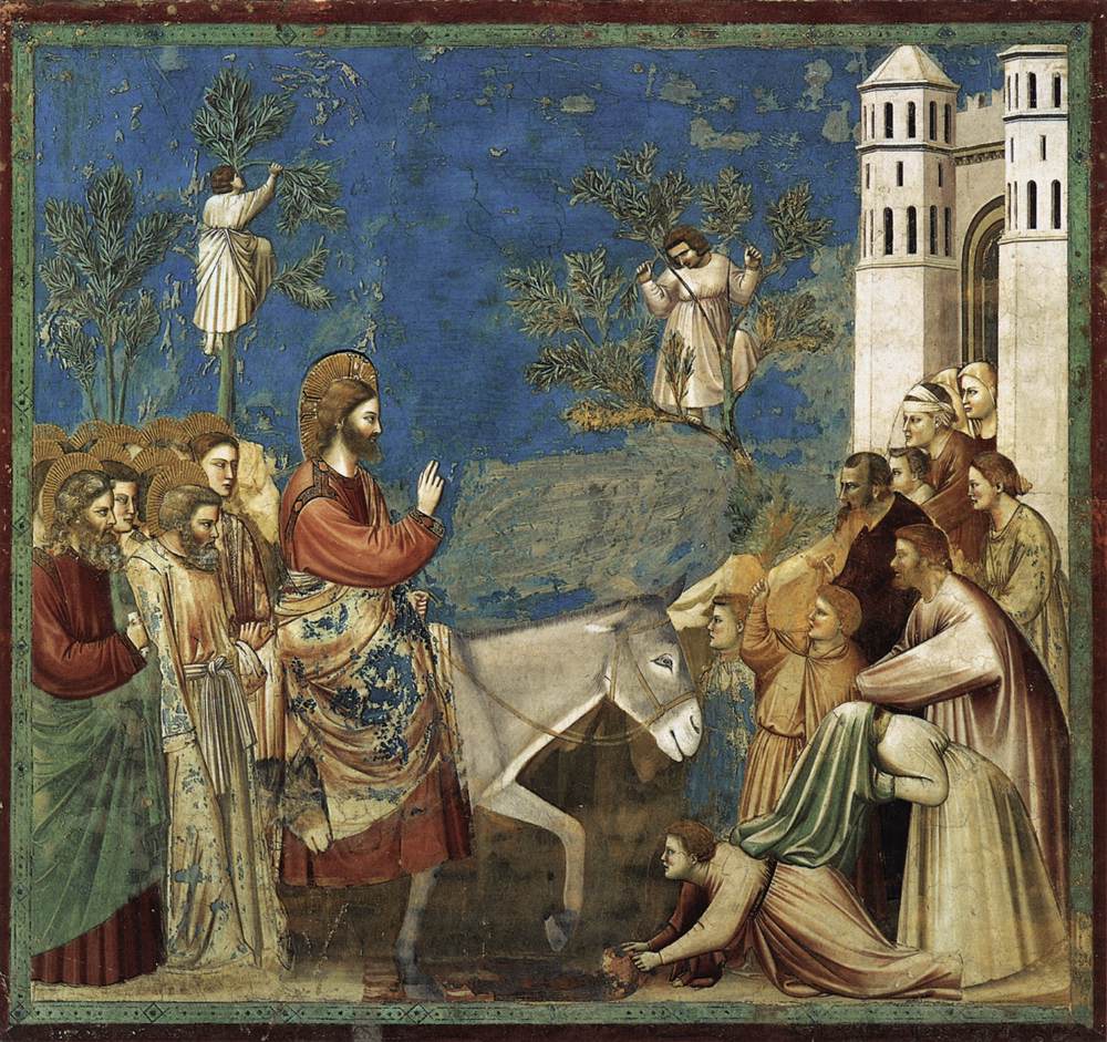
Giotto di Bondone Entry into Jerusalem 1304-06 Fresco 79″x73″ Capella Scrovegni, Italy
Line: Lines are employed in this image to create borders for the different shapes present, and in the careful modeling of the clothing. Everything has a clearly defined edge, with no soft blending of forms, creating a solid division of subjects.
Shape: The horizontal composition of the image is weighted heavily at the bottom two-thirds, with the central character on the left third. The negative space in the sky lowers in the middle to create a form of separation between the two groups, aided by the shape created by the donkey. The figures, trees, and building add a vertical element to the composition, with the hand of christ also pointing upward. The group of figures on the right are arranged in a sloping triangle
Value: Giotto uses a range of values, most striking in the rendering of folds. He also uses value on the shading in the skin and on the shadows on the building, implying his new understanding of light. However, the picture is mainly devoid of value used to create an obvious light source on the figures, making them appear to be perfectly lit with no shadows cast by their arms or the figures standing around.
Color: The affects of fresco on pigmentation are apparent in the pastel color palette of this painting. The colors are also limited to blues and earth tones that lack the vibrancy of oil paints. The overall look is soft and light, with the lighter figures stark against the darker solid blue in the sky. The blue sky is also a realistic step forward from the common golden flat backgrounds used in the Byzantine style.
Texture: Rendering the clothing in the usual idealized perfectly-draped style creates a soft feel to this picture with relatively little texture besides that created in the crumbling plaster. The lack of high detail loved in the northern renaissance makes this image overall more calm and gentle on the eyes. Small touches of texture in the leaves on the trees and the detail on the halos keep this from being too plain and add a nice contrast to the otherwise smooth painting.
Space: Giotto shows his progress from Byzantine art in the use of perspective in the building and the mass of bodies give this image a sense of depth that is absent from earlier art. The setting is almost stage-like in space, with no far reaching background to create an absolute sense of realism.
High Renaissance
As time progressed, the Italians learned more from both studying Greek and Roman art and looking directly at nature. They used classical styles in their architecture, rediscovered the equestrian stature beloved by the Romans, and further developed perspective. Artists became interested in showing emotion and giving mind to their figures in painting and in sculpture. Also, the Italians finally started to use oil paints.
Leonardo da Vinci in particular was interested in showing how people think and connect with each other in his paintings. He was an early adapter of oil paints in Italy.
Leonardo da Vinci The Virgin and Child with St. Anne 1508 Oil on wood 66 in × 44 in
Line: Leonardo was a master draftsman, and it shows in the careful flowing lines used to mark the figures . The soft lines separate forms without creating a harsh edge, adding to the overall gentle feeling of the image.
Shape: The figures create a triangular shape in the middle of the vertical composition, with the widest part at the bottom. Rather than separate forms, the figures create one cohesive mass to center the eye in the middle left. The figures themselves show the classical influence of the time, with idealized features and proportions.
Value: A full value range is used, with the lightest part being the skin of the center figure, and darkest in the skirt and tree. The dark tree balances the weight of the composition as a counter to the large figures. Heavy value contrasts are mostly absent in the skin, with soft shifts employed carefully to render the perfect ideal of femininity.
Color: A somewhat limited palette is used, with the majority of colors falling in the red and blue hue spectrum. The colors combine with value to divide the bottom of the painting from the blue top third, helping draw the eye to the central figures.
Texture: There is some texture in the rocks and mountains, and in the fur of the lamb. Otherwise, the rest of the painting is mostly smooth with idealized rendering in the clothing and skin mostly devoid of harsh texture. Da Vinci shows the Italian concentration on the figure rather than the northern renaissance obsession with detail, making this painting soft and gentle rather than crisp and hyper-focused.
Space: A slight illusion of space is created with the atmospheric perspective in the mountains in the background, but the image is concentrated on the group of figures at the front . There isn’t much implication of a mid-ground to separate the figures from their immediate environment- it looks like they could be sitting in front of a tapestry or fresco. The space is reminiscent of Giotto di Bondone’s stage-like settings.
Design project: An Italian noblewoman.
Fiorella Borghi Ca. 1503 Florence, Italy
For this project, I chose to imitate the style of Leonardo da Vinci. My character is a member of a wealthy Florentine family. I tried to capture the classic ideal of beauty with this portrait, which ended up not looking as much like me as my previous one. I noticed that da Vinci tended to depict women with the same perfect, straight, small nose and small mouth, so I gave myself a bit of a nose job and shrunk my lips.
For composition, I referred to this image:
Leonardo Da Vinci la Belle Ferroniere 1490 Oil on panel 24.8″x 17.7″
And also this image:
Leonardo da Vinci Mona Lisa 1503-06 Oil on panel 30 in × 21 in Musée du Louvre, Paris
Since the Mona Lisa’s original composition included columns behind her, I chose to include columns in my image. You can see a hint of the columns on either side of the painting, but to get a better idea of what they might have looked like I used this image by Rafael:
Rafael Young Woman with a Unicorn 1506 Oil on panel 26 in × 24 in Galleria Borghese, Rome
For her clothing, I referred mainly to this portrait by Girolamo di Benvenuto, and added a shawl in an attempt to make it look a little more like the elegant drapery in da Vinci’s Mona Lisa.
Girolamo di Benvenuto Portrait of a Young Woman 1508 Oil on Panel 1508 22 7/8×11/16 in National Gallery of Art, Washington DC
Sofonisba Anguissola- female Renaissance artist
Sofonisba Anguissola Self-Portrait at the Easel 1556 Oil on canvas 26 × 22.4 in Łańcut Palace, Poland
Sofonisba Anguissola was one of the first female artists to gain acclaim and status similar to that of her male peers. While Caterina van Hemessen did well as an artist, she was fairly unknown. Sofonisba was much more prolific than her northern counterpart, and produced a multitude of paintings that were admired by the likes of important figures such as Michelangelo. She was even mentioned in contemporary art historian Georgio Vasari’s Lives of the Artists and given praise otherwise unheard of for a woman. Her father played an important role in supporting and financing her early studies in art, and continued to support her and her sisters in their ambitions throughout his life. (2) (3)
Sources:
(1)Kleiner, Fred S., and Christin J. Mamiya. “From Gothic to Renaissance.” Gardner’s Art through the Ages. 12th ed. Belmont, CA: Thompson Learning, 2005. Print.
(2)Chadwick, Whitney. Women, Art, and Society. New York, NY: Thames and Hudson, 1990. Print.
(3)Sutherland Harris, Ann, and Linda Nochlin. Women Artists 1550-1950. Los Angeles, CA: Los Angeles County Museum of Art, 1976. Print.
Kleiner, Fred S., and Christin J. Mamiya. “Piety, Passion, and Politics.” Gardner’s Art through the Ages. 12th ed. Belmont, CA: Thompson Learning, 2005. Print.
Earls, Irene. Artists of the Renaissance. Westport, CT: Greenwood, 2004. Print.
Lee, Alexander, and Pollman, J., eds. Renaissance? Perceptions of Continuity and Discontinuity in Europe, C. 1300- C. 1550. Boston, MA, USA: BRILL, 2010. ProQuest ebrary. Web. 7 December 2014.
Ormiston, Rosalind. Leonardo Da Vinci: His Life and Works. Wigston, UK: Lorenz, 2011. Print.
Since the age of the Byzantines, art in the western world was dominated by copying. For hundreds of years, people looked at other art as reference when creating new images, stepping away from direct observation. The Renaissance occurred when people once again started to look at nature to influence and improve their art. In other words, the Renaissance is a “re-birth” of direct observation.
This new way of looking at the world had several large impacts on art. Linear perspective was re-discovered, and started to show up in paintings. The western picture plane also come into use, and anatomy become more lifelike. These impacts were seen all over Europe. However, there are major artistic differences that separate Italy and the rest of the western art world. For this post, we will cover the Northern Renaissance.
What makes the Northern Renaissance different?
The “Northern” Renaissance covers, for the most part, all of Europe outside of Italy. In particular, Germany and the Netherlands were important centers for artistic development.
Unlike the Italian renaissance, the northern renaissance was more of a continuation of the native arts of Europe. Therefore, the art of this period mostly does not follow classic ideals or themes and is instead a continuation of medieval styles. What changed was a new concentration on realism, which moved art past the more basic iconography and into a new period of development.
Political and social changes in the 15th and 16th centuries aided in the development of art. As a whole, Europe was moving towards more stable and centralized forms of government, and non-religious wealthy patrons started to support the arts when before art was mainly commissioned by the church; this allowed for a new artistic freedom in style and subject matter that assisted the creative explosion in the western world.
Another big change that makes the northern renaissance stand out was the development of oil paints. Oil painting as a medium has much more vibrant and forgiving colors- since it takes a long time to dry, an artist could keep working on a single painting for weeks or even months. This was embraced by painters in the northern renaissance who valued saturated colors and extreme attention to detail.
Early adapters of oil paints were Jan van Eyck, Rogier van der Weyden, and Robert Campin. Jan van Eyck in particular was one of the first credited great oil painters, and his Ghent Altarpiece was admired throughout Europe. This piece is a classic example of northern renaissance art: vibrant use of compartmentalized color with high saturation, an intense level of crisp detail and fine lines, and a lack of classical ideals or themes.
Jan can Eyck Ghent Altarpiece (open) 1432 Oil on panel 11’6″x15′ Saint Bravo Cathedral, Ghent
From Handyman to Hotshot: changing status of the artist
Art itself wasn’t the only thing to change during the renaissance- the status of the artist also enjoyed a positive upheaval. Previously, artists were classified as craftsmen, and had the same status as a cobbler, weaver, tanner, etc. They worked with their hands, and were therefore grouped with the other professions that required hand-work. In cities where artwork was controlled by guilds, painters and sculptors often didn’t even get their own guild- they were grouped with other professions like stonemasons and carpenters. As lowly craftsmen, artists before the renaissance rarely signed their work and as such most artwork from the medieval period is anonymous. With the social and political changes going on during the renaissance, artists gradually began to sign their work- which shows that they were no longer viewing themselves as lowly craftsmen and were making their names known as more that just an anonymous worker. Documents from the era show that painters were starting to quarrel over fees- whereas before artists were all paid the same for the same amount of work, artists who had created a name for themselves were starting to demand higher pay than their less-famous peers (1).
Early Northern Renaissance- Analyzing an Altarpiece
One popular form of early renaissance painting was the altarpiece. Used as a backdrop for Mass, they helped provide a visual for the complex Christian theological concepts that were involved in the ceremony. As such, they were viewed as an invaluable asset and the ultimate display of piety. (2)
Robert Campin
The Entombment Tryptych
1425
Oil and gold leaf on panel
65.2 cm (centre) (integral frame and double-arched top); width: 53.6 cm (centre); height: 64.9 cm (each wing); width: 26.8 cm (each wing)
The Courtauld Gallery, London
In the above image, the continuation of medieval artistic notions is apparent. The background has the Byzantine golden flat void, and the modeling of the clothing also invokes the sharp lines and stiff folds seen in previous eras.
Line: This painting utilizes strong outlines to border the different shapes, separating colors and forms with a clear border. There is little blending or fading of edges, with everything carefully compartmentalized.
Shape: The composition of this image is carefully constructed to fit within the confines created by the shape of the altarpiece it is painted on. The artist uses figures to fill the front and center, creating a large mass of color and value at the bottom two-thirds of the image, with the top being filled with gold leaf and smaller figures. This focuses the eye on the center most figure.
Value: A wide range of values are used, from the near-white in the cloth to the almost black of the foliage. Mostly, the values are compartmentalized and there is only a small amount of blending used in the rendering of skin and cloth. This gives the image a crisp and vibrant look, without any soft value blending.
Color: The medieval love for compartmentalized, highly-saturated color is clear in this image. All the colors are within clearly defined shape boundaries of clothing, skin, etc, with no lost borders or blending into the background. The colors are all highly saturated, and there is little variation within the specific colors (the red is mostly all red, and the yellow is unadulterated etc).
Texture: Texture is a large part of this composition, with the high concentration of detail in the gold leaf of the “sky” and the intricately rendered plants in the foreground and mid ground contrasting with the smooth painting on the clothing and skin of the figures. This high level of detail in the image is classic of the northern renaissance.
Space: While some illusion of depth is attempted in the landscape and size difference between the figures in the middle and those to the sides, this composition is mostly flat and centered on the group of figures at the front. Overlapping forms keeps the group from appearing devoid of perspective, but the utilization of the golden background removes the image from a sense of realistic space.
For some interesting information on these images and how they were painted, see this video:
Late Northern Renaissance:
The 16th century saw a further explosion of artistic development. The advent of the printing press brought an easy source of income for artists, so they were able to expand beyond spending all their time on large commissioned works, and had the added benefit of spreading their name beyond wealthy patrons. Artists began to paint things other than religious scenes and wealthy people- still lives, village scenes, and landscapes were brought back into popularity. Made-up creatures also appeared in art, with obvious reference to real-life creatures used in new and creative ways.
MARTIN SCHONGAUER, Saint Anthony Tormented by Demons, ca. 1480–1490. Engraving, 1’ 1/4″ X 9″. Fondazione Magnani Rocca, Corte di Mamiano.
Albrecht Dürer , celebrity artist:
Albrecht Dürer was one of the first internationally acclaimed artists. He traveled to Venice and Italy, and his wide use of the printing press made sure that his name was know throughout Europe.
Albrecht Durer
Portrait of Elizabeth Tucher
1499
Oil painting on panel
Staatliche Kunstsammlung, Kassel
Line: This painting uses line to contain different shapes of color, not allowing colors to bleed into each other. This gives the image a crisp, focused look.
Shape: Composed centered on the left third of the panel, this image is dominated by the smooth rounded shape of the woman’s headdress and face. The shape of the mountains and greenery also aid in drawing the viewers eyes back to the figure’s face in the center.
Value: A wide range of values is used in this, with the light color of her headdress and the darkest in her dress. The contrast is striking, and naturally draws the eye towards the lighter value in her face.
Color: Dürer uses a limited color palette that follows the common blue-green-brown scheme in the background, with an added yellow/orange for the tapestry behind her and the details on her clothing. The image over all has a warm glow to it, centered on her skin.
Texture: The clothing is rendered in the typical hyper-perfect fashion popular in the northern renaissance, with every wrinkle perfectly set and her neckline a smooth curve of cloth. The greenery in the background adds a a textural contrast to the otherwise smoothness of the woman.
Space: Dürer shows an understanding of perspective with his use of atmosphere to give depth to the landscape outside the window, but the majority of the composition is dominated by the close-up of the woman. The tapestry behind her adds to the over-all mainly flat feel to the image, with the sliver of window being the only real sense of space.
Design project: Female Artist of Nuremberg
Henrike Brinkerhoff Self-portrait 1514 Faux oil on panel (digital reproduction)
Henrike Brinkerhoff is my Nuremberg persona. She lived in the early 16th century and worked as an artist at her father’s studio. As a woman, she was lucky to have a painter as a father since that was one of the only ways for a woman to learn the trade. In this portrait, she is holding a pair of glasses to symbolize her struggle with poor eyesight. I tried to capture the realism that was valued in the northern renaissance by keeping my wide nose and butt chin as true to life as I could depict. If I was more skilled and had the months Durer spent on his paintings, then I would add a lot of detail and crisp edges to further follow the style of the time. For the landscape seen in the window, I followed the brown-green-blue color scheme.
I composed this in the typical three-quarter, looking at the camera view, using Durer as a style reference, in particular this image:
Albrecht Durer
Self-Portrait at 26
1498
Oil on panel
52 x 41 cm
Museo del Prado, Madrid
And, for composition, I based it on this image:
Albrecht Durer Portrait of Elsbeth Tucher 1499 Oil on wood 29 x 23 cm
For her clothes, I used these images as reference for styles in Nuremberg around the time my fake portrait was made:
Albrect Durer, The Cook and His Wife 1496 Engraving
Albrecht Durer Seated woman1514 Pen and ink
Albrecht Dürer, Portrait of a Young Fürleger with Loose Hair, 1497, oil on canvas
For her story as a female artist, I used Caterina van Hemessen as a model. Hemessen was taught by her father, since women weren’t allowed to be apprenticed at an artist’s studio the only way they could learn the trade was if they were born into a painting family or married into one. She has relatively little extant work, and it is most likely that she stopped painting after her marriage. However, one of her paintings is a self-portrait which shows valuable insight to female artists of her time (3).
Caterina van Hemessen Self Portrait 1548 tempera on oak panel 12.6 × 9.8 in Kunstmuseum Basel, Switzerland
Sources:
(1) Barker, Emma, Nick Webb, and Kim Woods. The Changing Status of the Artist. London: Yale UP, 1999. Print
(2) Kleiner, Fred S., and Christin J. Mamiya. “Piety, Passion, and Politics.” Gardner’s Art through the Ages. 12th ed. Belmont, CA: Thompson Learning, 2005. Print.
(3)Chadwick, Whitney. Women, Art, and Society. New York, NY: Thames and Hudson, 1990. Print.
Charles, Victoria. Art of Century : Renaissance Art. New York, NY, USA: Parkstone International, 2012. ProQuest ebrary. Web. 6 December 2014.
Sutherland Harris, Ann, and Linda Nochlin. Women Artists 1550-1950. Los Angeles, CA: Los Angeles County Museum of Art, 1976. Print.


_-_1498.jpg)


